
Case Study / Fertility & Maternal Health
Reimagining the
Fertility Care Experience
Ferring Pharmaceuticals came to Inizio Evoke with a problem that sits at the intersection of clinical complexity and profound human vulnerability. Their fertility platform needed to serve three fundamentally different audiences — prospective parents navigating one of the most emotionally charged decisions of their lives, fertility professionals seeking clinical authority and research tools, and business partners evaluating Ferring as an institutional partner. I led the UX strategy and design direction for the full redesign, building a platform that could hold the emotional weight of the patient experience without sacrificing the scientific credibility the clinical and business audiences required.
from a single unified platform
form submissions, and time on site
Ferring Fertility & Fertility Out Loud
Strategic Challenge
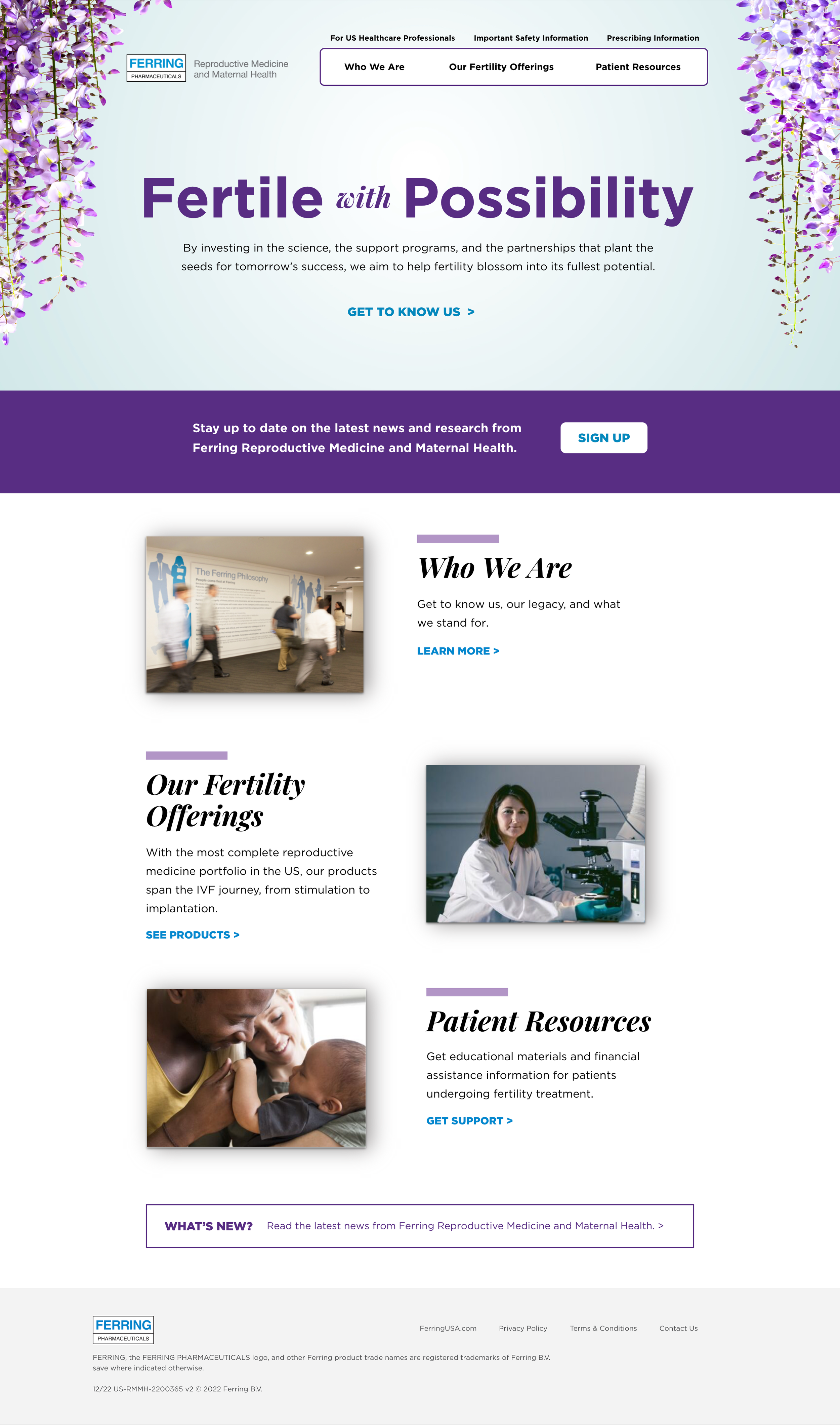
Fertility is not a typical healthcare category. The people coming to this platform aren't browsing — they're at a decision point that carries enormous emotional stakes. The existing site treated fertility like a product catalogue: technically complete, emotionally inert, and structured around Ferring's internal organization rather than how patients or clinicians actually think about fertility care.
"The central design challenge was one most healthcare digital work gets wrong: how do you make something feel warm and human without making it feel unserious — and how do you make something feel clinically authoritative without making it feel cold?"
Three problems needed solving simultaneously. First, an information architecture that buried critical content under navigation designed for internal logic, not user need. Second, a tone that read as pharmaceutical rather than human — failing both the patients who needed warmth and the clinicians who needed authority. Third, no meaningful differentiation between audiences: patients, fertility professionals, and business partners were all arriving at the same front door with entirely different needs, and the experience gave them no meaningful path to what was relevant to them. My mandate was to redesign all three dimensions at once without letting any single audience dominate the experience at the expense of the others.
Discovery & Research
I structured the discovery phase around a question the existing site had never properly answered: what does each audience actually need to believe before they take the next step? The research had to bridge clinical expertise and lived patient experience — two registers that are rarely brought into the same room.
Method 01
Stakeholder Interviews
Directed sessions with Ferring's internal teams including reproductive medicine specialists — giving us access to clinical knowledge most digital agencies never leverage. Understanding the actual science of fertility treatment, the emotional arc of a patient journey, and the information gaps that frustrate clinicians gave us the foundation to make content decisions that were medically credible and experientially sound simultaneously.
Method 02
Competitive Analysis
Led a systematic audit of fertility clinic and pharmaceutical brand digital experiences to identify where the category was setting the bar and where it was consistently failing. A consistent pattern emerged across competitors: sites that chose between clinical authority and emotional warmth rather than achieving both. That tension became the central design problem to resolve.
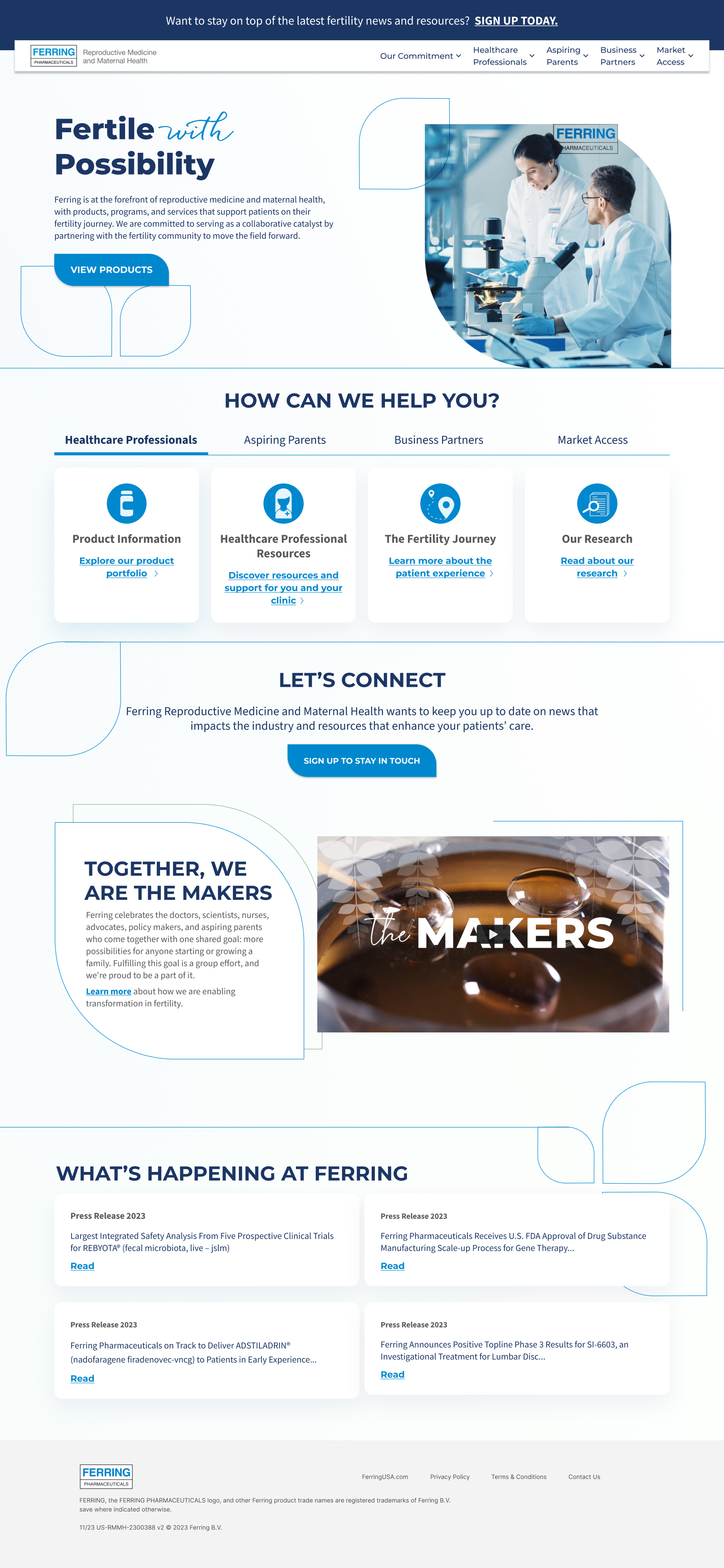
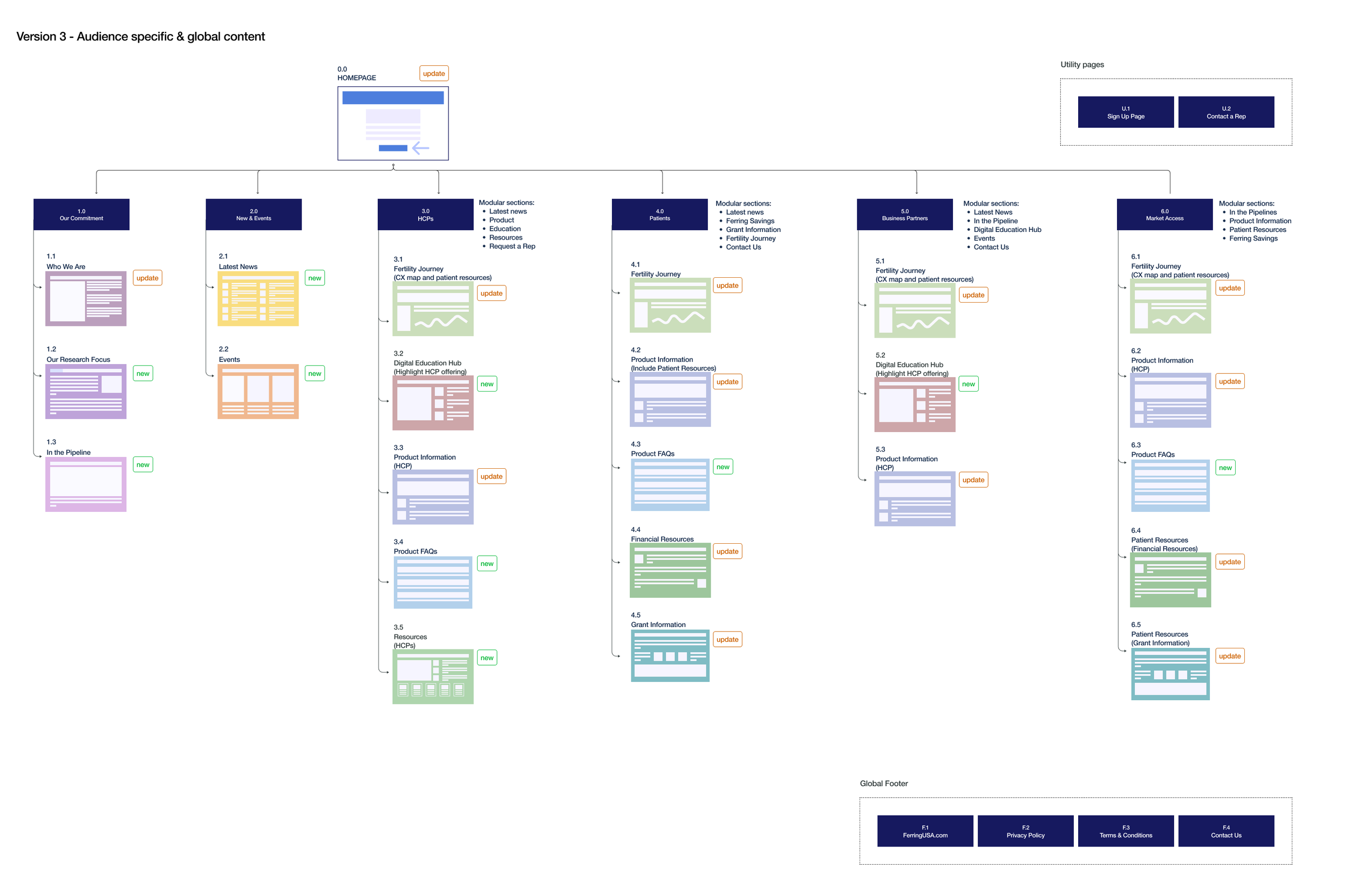
Audience Architecture & IA
The most consequential structural decision was treating the three audiences as requiring genuinely distinct content pathways — different information hierarchies, different entry points, and different definitions of what a successful visit looked like. The result was a platform that felt cohesive to every user while giving each audience a clear, purposeful path to what they needed.
Audience 01
Prospective Parents
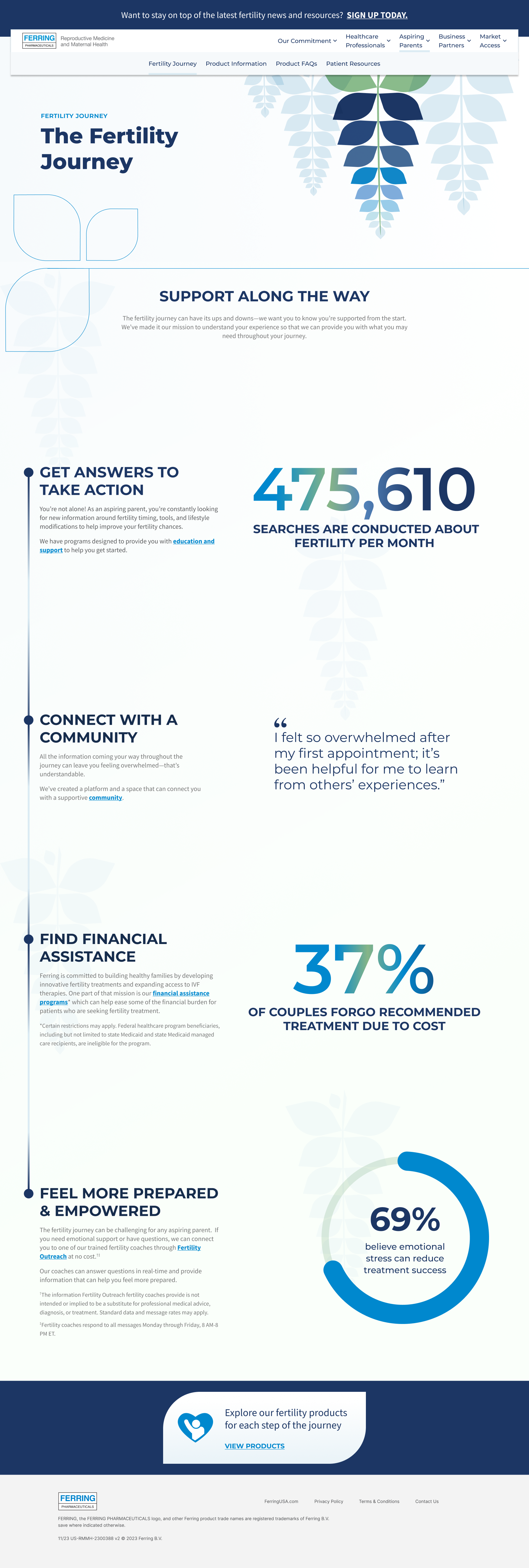
Navigating one of the most emotionally charged decisions of their lives. The IA was organized around the emotional arc of a fertility journey — building confidence progressively rather than front-loading clinical complexity.
- Patient journey insights sequenced to build understanding, not overwhelm
- Treatment FAQs structured around real patient concerns, not product categories
- Diverse family imagery curated to represent the full spectrum of who pursues fertility treatment
- Tone that acknowledged the emotional reality of the situation first
Audience 02
Fertility Professionals
Clinicians who need fast access to clinical research, treatment protocols, and educational tools — without navigating through patient-oriented content. A dedicated pathway that signaled scientific authority from the first interaction.
- Clinical research and trial data surfaced immediately at entry
- Treatment protocols and prescribing guidance clearly delineated
- Downloadable resources prominently placed and labeled
- Content density calibrated to professional users comfortable with detail
Audience 03
Business Partners
Institutional partners evaluating Ferring as a commercial relationship. Needed Ferring's research leadership, pipeline, and partnership model presented with the directness appropriate to a professional making a business evaluation.
- Institutional credibility signals at the forefront
- Research pipeline and scientific leadership clearly communicated
- Partnership model and engagement pathways easy to find
- Tone calibrated to professional evaluation, not patient reassurance
Design Direction
I directed a visual language that held warmth and clinical authority simultaneously — the two registers most healthcare digital work treats as mutually exclusive. Every design decision was made to serve both at once, with accessibility and scalability built in from the start rather than added at the end.
Dual Visual Register
Soft, rounded typography and a palette drawn from blues and greens communicated approachability and hope for patients. Clean, modern layout structures and precise scientific imagery communicated Ferring's research leadership to professionals. Both registers operated from the same design system — the differentiation was tonal, not structural.
Curated Imagery Strategy
Diverse family imagery was selected deliberately to represent the full spectrum of people who pursue fertility treatment. Representation wasn't decorative — it was a trust signal for patients who needed to see themselves in the platform before they could trust the information it contained.
Accessibility as a Design Constraint
WCAG standards shaped every color, contrast, typography, and interaction decision from the first wireframe — a particular priority for a patient population that may be managing significant physical and emotional stress during their interactions with the platform.
Scalable Design System
A flexible component library built to accommodate future product additions and content updates without requiring structural redesign — giving Ferring's internal team the infrastructure to maintain and evolve the platform independently as their portfolio grows.

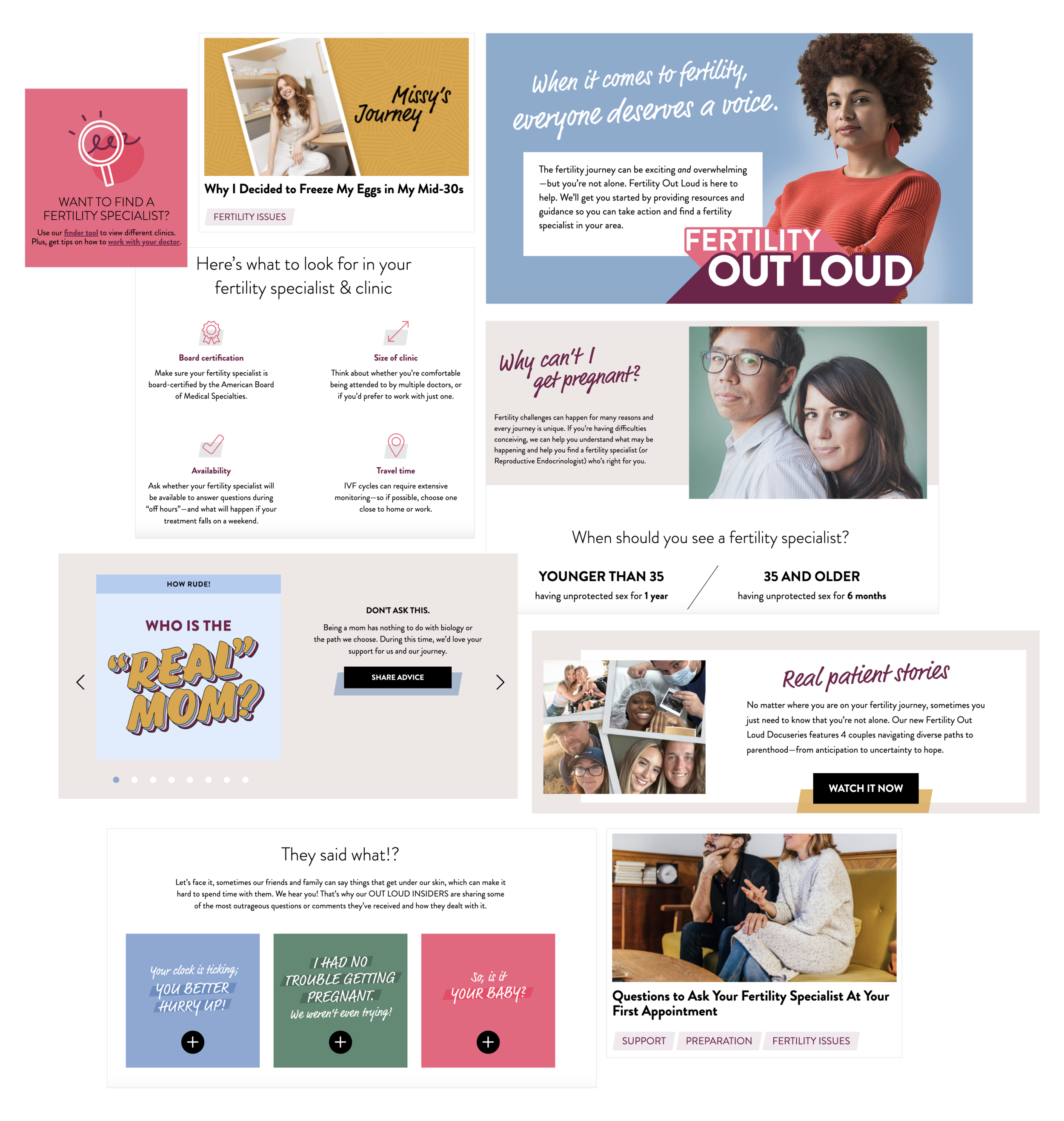
Related Platform
Fertility Out Loud
In parallel with the core Ferring platform, I led the design and ongoing optimization of Fertility Out Loud — Ferring's community platform dedicated to destigmatizing infertility and connecting patients with resources, peer stories, and clinical tools including a reproductive endocrinologist finder and insurance navigation guidance. Where Ferring.com balanced clinical authority with warmth, Fertility Out Loud led entirely with community, human story, and emotional safety. I maintained and updated the platform monthly, curating real patient narratives and ensuring the experience continued to meet the needs of a growing community. The two properties worked together as a coherent digital ecosystem — each serving its audience with precision while reinforcing Ferring's overarching mission in reproductive health.
Outcomes & Impact
The redesigned platform delivered measurable improvements across both audience segments while establishing a design infrastructure that gives Ferring the foundation to grow without rebuilding.
Increased Engagement
Visitors spent meaningfully more time exploring content post-launch — validating that the restructured navigation and content strategy was meeting users where they were rather than directing them where Ferring assumed they'd go.
Higher Conversion
Simplified patient journeys and streamlined clinician access to research tools drove measurable increases in form submissions and information requests — the primary conversion actions for both audience segments.
Scalable Design System
A flexible, accessible component library giving Ferring the infrastructure to grow and update the platform without compromising design quality or usability — an investment in the platform's long-term sustainability, not just its launch state.
Dual-Platform Ecosystem
A coherent digital presence across Ferring Fertility and Fertility Out Loud — each serving its audience with precision while reinforcing Ferring's mission in reproductive health as a unified brand expression across two distinct platforms.